It looks like I over-engineered my website (again)
This article is about an old version of the website, which is not online anymore.
The previous version of my personal website was not even 1 year old, and I was not planning to throw it away so soon. However, like many other people in the world, I happened to have some extra time during spring 2020 and I decided to use this time to do a complete rewrite of the website, and at the same time try (and learn) a couple of new things.
First of all I focused on my requirements. Some of them are a "must" for me and were there already in the previous version:
Should be a React Project
Should be Mobile first
Should be blazing fast and SEO friendly
Content should be managed with a headless CMS
In addition to this, I had some new goals:
No React Class components
Even though class Components are not officially deprecated, the cool thing of writing something from scratch is that I could focus on entirely using the new API, which is of course React Hooks.
Typescript
We've been using Typescript at Styla for over 2 years now and it helped us a lot in writing high quality and more resilient code. Therefore I decided to adopt it as well for this personal project.
Animations
I wanted to experiment with animations in a way that they can give added value to the overall UX. Therefore animations should be adopted only where it makes sense and shouldn't be overused.
Layout
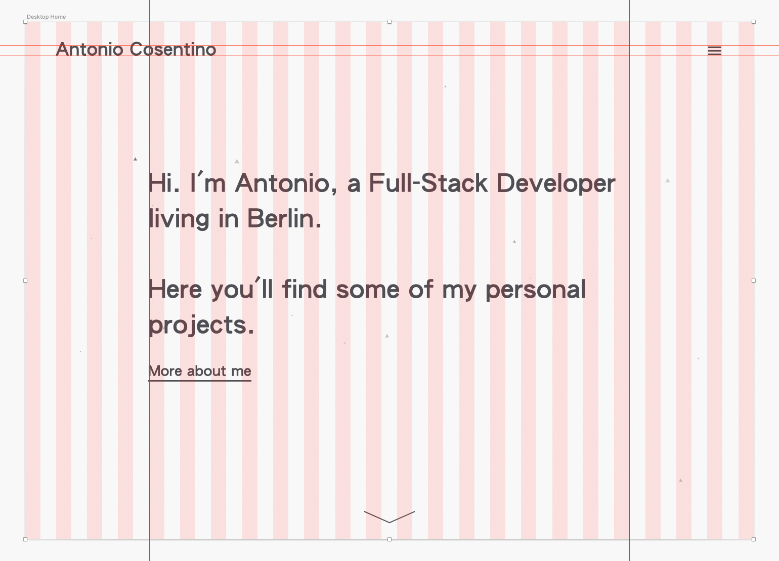
As opposed to the previous version of the website, which was very colorful and used a live-generated color palette, I decided to go with a minimalistic approach: a basic black and white color scheme and a simple layout.
Given that, as I mentioned, this is a mobile-first project, I opened Sketch and started to design the Homepage and Projects view for mobile. I decided to use a 24 columns grid and to never constrain the container to a limited width. The only exception is the project content text, where I confined the text in a 840px container (which is the equivalent of 12/24 columns at a 1680px horizontal viewport) for readability purposes.

After that, I did the same with Desktop. The idea was to have big text, always proportioned with the current viewport (something that I could achieve by using a vw value together with font-size).

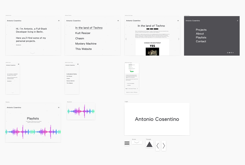
After having a well defined structure for both mobile and desktop, I finalized the Sketch project with the missing views: Menu, Single Project view and Playlists page.

Project Setup
Once the design was defined I started setting up a project, with the following configuration:
React
Webpack
Babel
SASS
Typescript (using Awesome Typescript Loader )
For code linting I used:
eslint
sass-lint
Some CSS challenges
Since I'm widely using vertically centered content, one of the main challenges was to have this layout perfectly working on mobile, especially on iPhone X (and newer) and other mobile devices with FullView display. The main problem was, in fact, created by the "bottom inset area", which is that area initially containing the browser toolbar and then disappearing when the user scrolls down.
The problem is that, when using 100vh for defining the height of an element, the height will be calculated including a part which is in fact invisible, because covered by the browser toolbar. This toolbar disappears only when scrolling down, making this problem not relevant for elements placed below the initial view. While I fully understand why this was done in the first place, in some specific cases (like mine) it gives the idea that in the initial view something is not properly vertically aligned.
To see an example of this behavior check the demo.

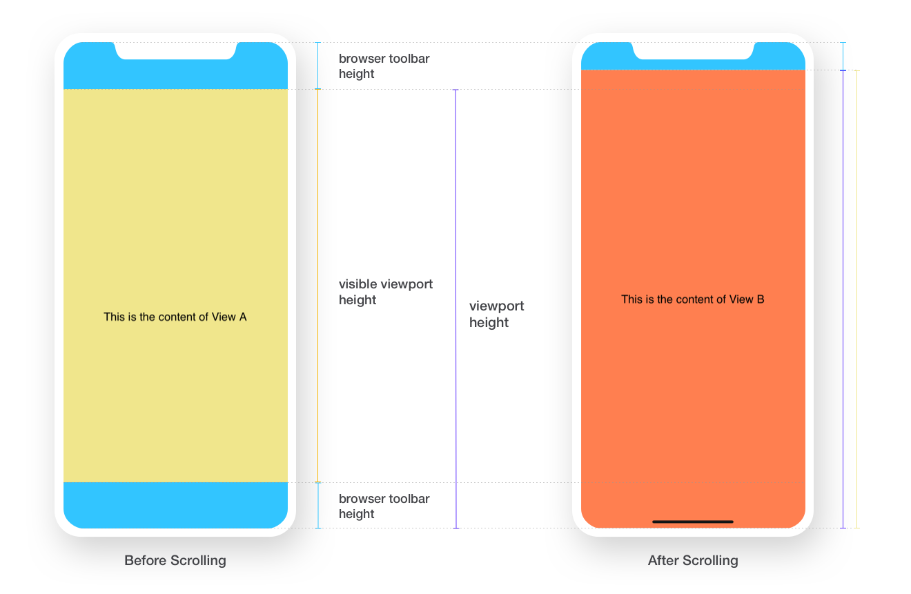
The way I decided to solve the problem was to use -webkit-fill-available.
This CSS property, in fact, allows us to use the whole visible space, without taking into account what's hidden behind the browser UI elements. I also needed to support other browsers which don't support this definition. Therefore I ended up with this @mixin in my .scss file:
While this solution works well in most of the cases, there is still a scenario where it doesn't work as expected: when arriving to the page by clicking on a link from an external website, with target="_blank". In this case, in fact, it seems that the mobile browser (at least Safari iOS) is doing a wrong calculation of the height, and returns a value which is even higher than the device height. To solve this other problem I created a CSS animation which forces the browser to do a reflow of the layout:
With this small "hack" the page is now rendered as expected even in this edge case. You can see the fix in action in the updated demo.
Animations
In the previous version of the website I played a little bit with React Spring and obtained some pretty interesting results. So I decided to play even more with it, specifically for:
react router page transitions
animating the projects list
animating the
<hr />elements (including the ones in this page)title fadeIn transitions
animating elements in the "About me" page
Parallax
One visual element that I wanted to introduce is Parallax on scrolling. I already implemented some parallax effects in the past and there's one thing that I've learned from it: building your own parallax scrolling library is absolutely painful, especially if you want to grant compatibility with multiple devices. Therefore I decided to rely on an existing library. I initially integrated react-scroll-parallax: it seems to be the most popular (speaking of React, of course) and the demo is quite impressive. However after seeing it in action in this project I noticed a couple of quirks, especially on mobile. It seems, in fact, that the above-mentioned problem with the bottom-inset-area was affecting the parallax effect as well: as soon as the browser UI was changing on scroll (causing the viewport height to be recalculated) the parallax elements were doing a sort of jump, creating a non-smooth experience. I checked again the official demo on mobile and noticed that this problem happens there as well, and I realized that the demo was not optimized at all for mobile. After re-reading carefully the documentation I found out that even in the official readme they discourage the use on mobile:
Even with these optimizations scroll effects can cause jank. If you use this lib make sure to keep images small and optimized, reduce the number of moving elements in view and on the page in total, and disable scroll effects on mobile devices. That should keep scrolling smooth and users happy.
Makes sense, but the problem is that I do want parallax on mobile 😅
My search went on and after other unsuccessful experiments I finally stumbled upon this excellent component called react-plx. Before implementing it in this project I checked the demo and I was positively impressed by the smoothness and performance, even on mobile devices. After realizing that we clearly had a winner I integrated it in my project and it can now be seen in action on the following pages:
Homepage
Single project page (yes, including this page)
Playlists page
At the end I was quite happy with the look and the performance so again, kudos to stanko for implementing such a great tool.
Particles Effect
The core design element of the previous website were triangles. Now, with this new minimal design approach, I still wanted to introduce this graphic element and I had this idea about having particles moving around, giving as well the feeling that the website is "alive". For doing this I used particles.js. The effect is disabled on purpose on pages like Single Project page in order to improve readability.
CMS
As in the previous version of the website, I chose Contentful as a Headless CMS for managing the content of this website. To render the Rich Text Format content inside the React project I used the official package rich-text-react-renderer which, in combination with rich-text-types, allowed me to use a different React component for every BLOCK type.
For example, I have a custom component for rendering images with the parallax effect, another one for hyperlinks and so on. I even created some custom content types (i.e. for video embedding and code snippets rendering) using the "embed entry" feature, provided as well by Contentful.
Playlists Page
Another "must" on my personal website is the Playlist Page, where I collect all my public Spotify playlists. In my mockups I had this colored audio wave idea:

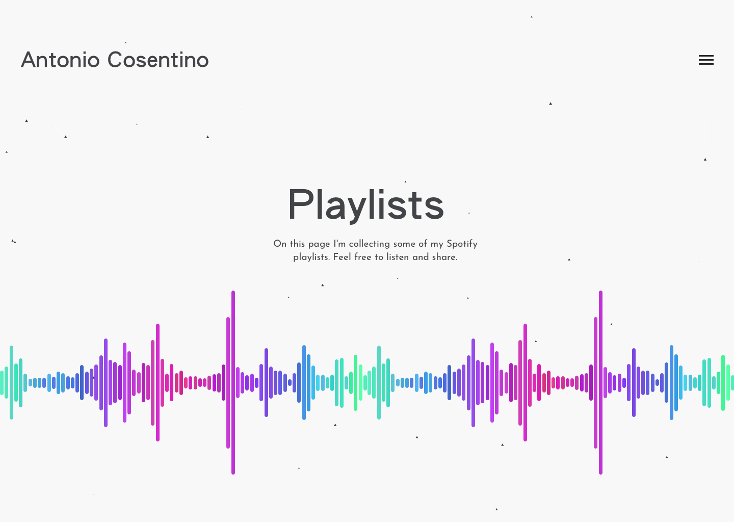
Rather than using a simple image I wanted this audio wave to be animated. Therefore I built a CSS only version of it, where every single bar is a simple CSS div with a dynamic height, and the number of generated bars depends on the current horizontal viewport. At the beginning the height of the individual bars was purely random. However this resulted in a weird effect: a real audio wave normally has a growing phase before the peak and a descending phase right after. With random, the peaks were most of the time isolated between short bars, therefore it didn't really look like an audio wave. As an improvement I decided to write an algorithm where the peaks are still completely random, but there are as well an ascending and a descending phase, which give finally the impressions of a real sound wave. Other than that, the height calculation is triggered again on scrolling, so the waves are moving with the user interaction.
SEO / OG Tags
Similar to what I did with the previous website, I used React Helmet for altering in real-time the <title> tag and the meta description. However I also needed a solution for pre-rendering static SEO content ad OG tags. For achieving this I created a PHP script which fetches the dynamic info from the Contentful API and injects the SEO content when the page is generated by the server.
In this way, the page contains static information even when accessed by scrapers or by the Facebook Sharing Debugger.
Deploy
Even if it's a small project and I'm of course the only person working on it, I wanted to have a CI/CD integration. Therefore I setup a deploy pipeline with Buddy which is executed automatically when I push my changes to master and takes care of:
Executing the production build of the project
Uploading the build files to my server
Executing the above mentioned PHP script for SEO generation
Sending me a notification about the deploy success / failure
Speed Optimizations
To improve website speed I did the following improvements:
Lazy Loading
Every image on the website is lazy loaded. I didn't use the native lazy-loading feature because I wanted to have cross-browser compatibility, so I opted for a custom implementation.
Font-display swap
By using font-display swap I could make sure that text is immediately rendered in the page even when the custom font has not loaded yet.
Gzip
Every asset is gzip encoded, by using Apache's mod_deflate.
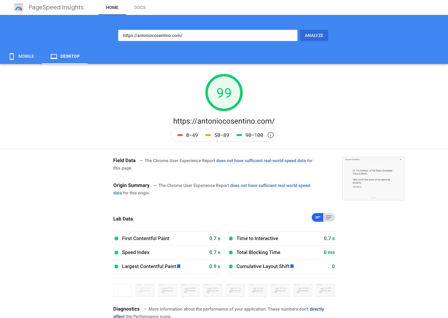
The Google PageSpeed score after all these optimizations is 90% on mobile and 99% on Desktop.