A new website AKA cut the bulls**t
While choosing the title for this post, I realized that this is the 3rd major rewrite of my website in a very short range of time. This might sound totally unnecessary considering that this is a personal website, and I'm not actually working with it. But then why? First of all I tend to get bored easily with the stuff that I make. That "post-launch enthusiasm" normally lasts for me only a couple of months, then I start thinking that I could have done something better. But more importantly, my website is normally the perfect playground for trying new things. If I screw up, well, it's just my personal website. But the opportunity of learning and experimenting something new is for me impossible to resist.
Thinking about how the new website should be, I came up with these requirements:
Blog VS Projects: these 2 concepts were kind of mixed up before. In some cases the project page was a story describing the development process and this would fit better into a Blog environment.
Cut the bulls**t. In the previous website I wanted to impress: animations, page transitions, parallax effects and so on. All things that required a lot of effort and, as I realized, didn't add any real value to the website.
Performance is a must: In the recent years I'm paying a lot of attention to performance metrics like Page Speed Insights and tried to perform as good as possible. However, with single-page applications it proved quite difficult to consistently score above 90%. This is why I realized that it was probably time for me to switch to a Jamstack architecture.
Music: in the previous versions of the website, my activity as a musician was just a tiny paragraph in my bio. I decided to dedicate a little bit more space to this part of my life.
Phase 1 - Layout
I got a little bit obsessed with International Typographic Style lately. I was always a fan of minimalism and I find very fascinating how this trend of design just never gets old. I even dedicated one of my projects to this.
So I opened sketch and created a basic mockup of the homepage

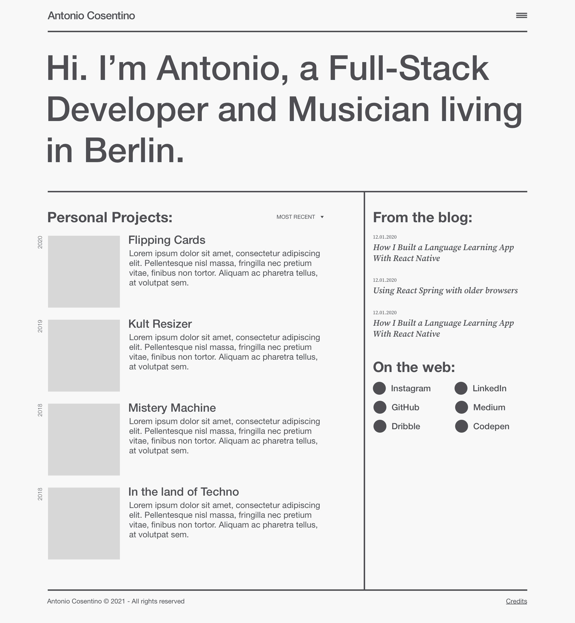
I created a clear distinction between Projects and Blog and decided to give a preview directly on the homepage. Moreover, I figured out that having a hamburger menu on desktop was not a very smart use of the available space. Therefore, I decided to go with a more traditional horizontal menu and use a hamburger menu only for mobile.
In the previous website I had some problems with the full-bleed layout, mostly due to the fact that in some cases you need to constrain the horizontal width (for example for the article page, where having too wide paragraphs would result in poor readability). Therefore, I'm constraining everything in a container and using solid lines as delimiters.
Phase 2 - Content
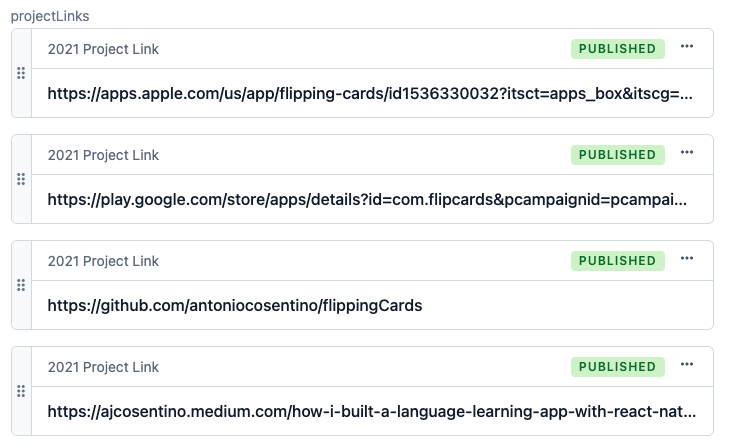
For content management, I didn't have to think too much about it. I was already using Contentful and this turned out to be the best solution in this project as well. I created different content types for blog, project pages, music entries and static pages (i.e. the About page). In addition to that, I also used a special entity type for project links and this allowed me to have a dedicated icon for each link type and in general have a visual consistency in all project pages.

Phase 3 - Time to code
As mentioned before, I wanted this website to be blazing fast and to achieve that I wanted to pre-render as much as possible using Static Site Generation. I collected some experience on this topic over the last year, thanks to the product we recently launched at Styla. In that case, given the complexity of the requirements, we implemented our own framework for SSG and SSR. In this case, however, everything is way simpler, so I thought it could be the right chance to play around with an existing framework. After some research the choice went on the increasingly popular Next.js by Vercel.
What convinced me to go with Next was the extremely well written documentation, and the fact that the community is growing a lot, therefore it's quite easy to find answers online when you're stuck.
I therefore started a new project using create-next-app and then did some customization in order to meet my needs, in particular:
Configured the project in order to use Typescript
Created custom
eslintandstylelintconfigsAdded sass in order to have well maintainable and scoped CSS
Added all the necessary Contentful packages
One of my doubts before starting with Next was: how can I pre-render all of my pages if I'm using a headless CMS, which will return content asynchronously via the API? Let's say for example that I have a projects page: the list of projects will come from Contentful. How can I tell the pre-rendering script to wait for the content to be there?
Well, it turned out that this is very simple. All you have to do is export an async function called getStaticProps and put the fetching logic inside here. That's all! This content will then be available as props for your functional component.
But what about dynamic routes? For example, the page hosting this article is obviously not part of the codebase, and its existence is determined by the set of data returned by Contentful. Well, in this case I'm relying on a wildcard page, in my specific setup called [slug.tsx], and to define which ones are the paths that are supposed to be generated at build time I'm using a similar mechanism as what I explained before, but this time with getStaticPaths.
The amazing advantage of this implementation is that frontend is not doing any XHR request to Contentful: all the requests are done at build time, when the static pages are generated. This means that all my pages are accessible even with JS disabled, which is a great bonus for SEO. If I update some content, I only need to re-deploy the website and voilà, the new content is live. This process can potentially be entirely automated by using Contentful Webhooks, but I decided to not do this for now, given the small rate of updates that I will trigger.
Phase 4 - Some fancy stuff
Yes, I know, earlier I've said that I didn't want to do the fancy stuff. However, there are two things that I still wanted to do:
Yellow blob
Music equalizer (V2.0)
Yellow blob
I had this idea of a yellow blob moving behind the header titles.
To achieve this, I opened Sketch and created 5 different shapes:

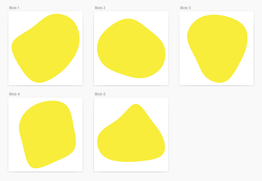
Then I exported them as SVG paths. And here comes the fun part: at every website load, I'm randomly picking two of these shapes and constantly morphing between them using a CSS animation that runs in an infinite loop. In addition to that, I'm also using another SVG animation to move and rotate the blob around. Also in this case, all the values of the animation are generated randomly at browser load time, which means that each user will get a different animation. The only bummer here is that the first CSS animation (the one about morphing the SVG path) seems to be unsupported in Safari. This means that Safari users are only getting a basic version of the animation.
Music equalizer (V2.0)
The Music equalizer was already there in the previous version of the website. However, in terms of performance, it was a complete disaster. Back then, I didn't think enough about the implications of generating a div for each bar of the equalizer. In some cases this was so CPU heavy that it was even crashing my Chrome. Not to mention what happened when trying to load it in a cheap tablet...
Anyway, after learning from my mistakes, I recreated the equalizer with a dynamically generated SVG. Every click on the element triggers a new random set of values and the animation is now incredibly smooth and performant.
Phase 5 - Hosting + Deploy
Where do I host all of this? I considered for a while creating my own pipeline and host the website on my already existing server. But, after some thoughts, I realized that, considering this is a Next.js project, it's way more practical to host it directly on Vercel.
In this way, in fact, basically all I need is already taken care of:
Hosting (free for a personal, non-commercial project)
Automatic deploys
Different environments (for example, I have a complete stage setup where I can test my changes before shipping them on the main branch)
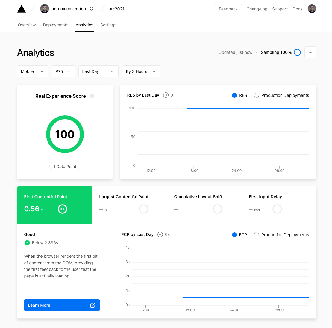
Performance Analytics (like Real Experience Score, more on this in the next paragraph)
Domain and CDN management
Phase 6 - Performance
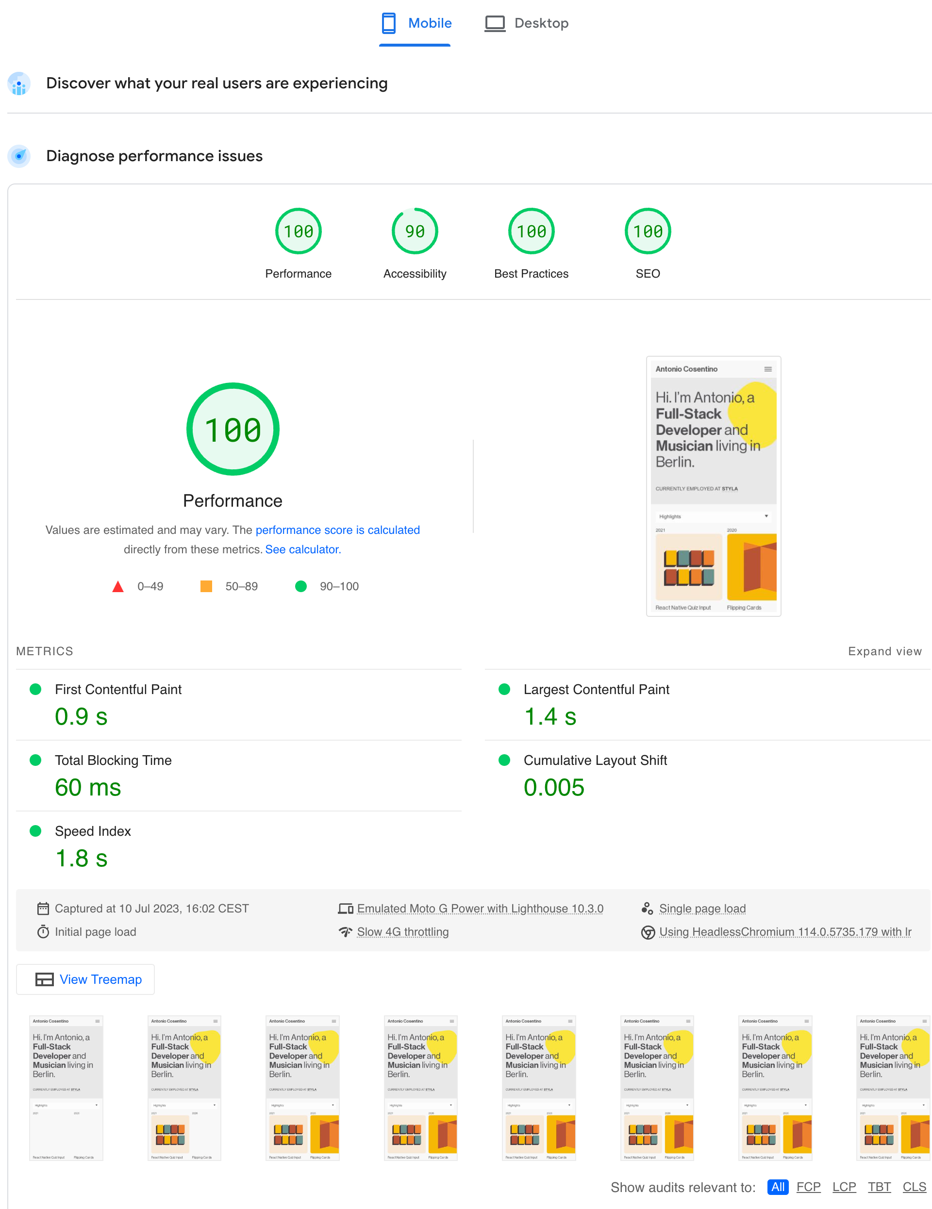
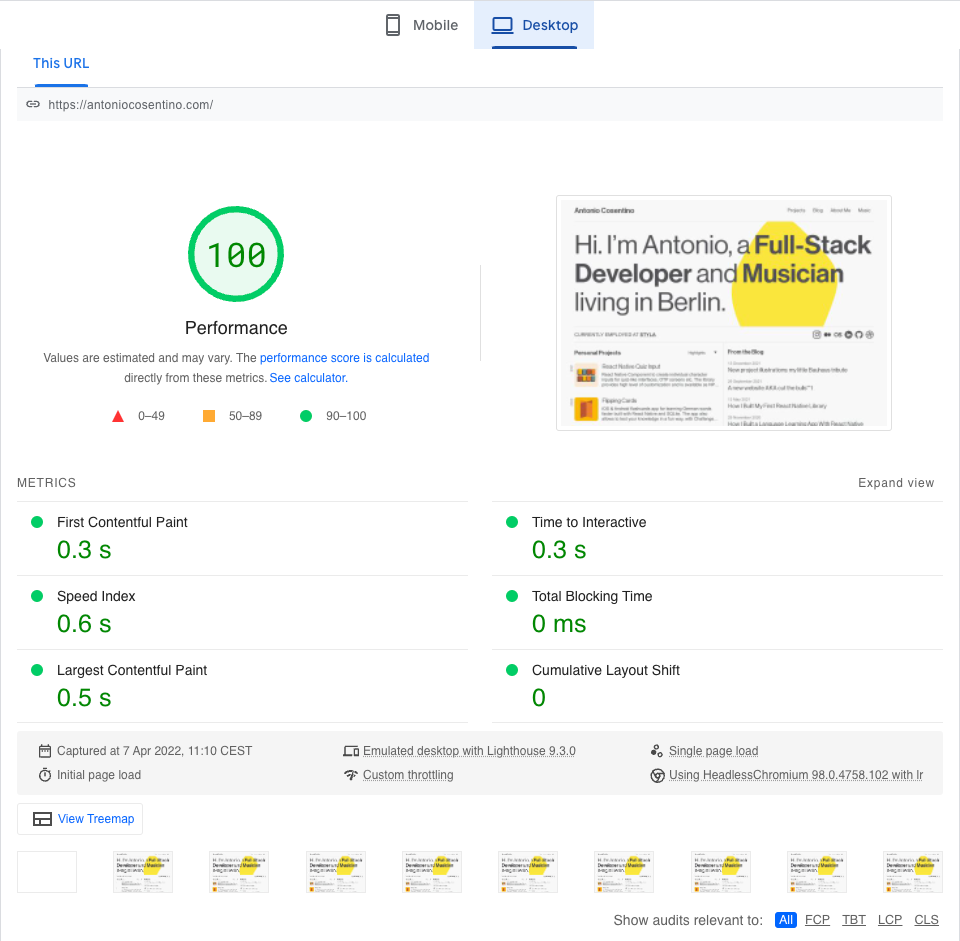
Well, this is not really phase 6. As a matter of fact, considering that performance was one of the most important metrics for me, every single feature of this project was developed with performance in mind. During the whole development phase, I was always scoring above 90% on Page Speed Insights.
But then something happened: the very last thing I did before going live was to add Google Analytics tracking code to the pages. After doing this I re-checked and, to my great surprise, mobile score started dropping below 90% (in some cases even below 80%).
I started investigating the reasons and I figured out that the Google Tag Manager snippet had a huge impact on speed. Which is kind of ironic, because it's a tool from Google that is making you perform bad on another Google tool. But at the same time it's a good sign, because it means that the page score is reliable and unbiased. Anyway, after struggling for a while with this, I started researching on an alternative that was not going to impact me so much. And this is how I discovered Matomo (formerly known as Piwik). The interesting thing about this software is that they have a free open-source version that you can install on your own server. I gave it a try and noticed that the impact on the speed score was way lower in comparison with Google. Therefore I decided to adopt this solution and checked again the results: 100% on mobile, 100% on desktop and 100% Real Experience Score (according to Vercel). Mission accomplished.