New project illustrations: my little Bauhaus tribute
In a previous article I mentioned how I normally tend to become very critical of something that I just made, to the point that I feel the need of throwing it away or rebuild it from scratch. Luckily this didn't happen (yet) with my new website, however there was something I wasn't fully convinced of: project illustrations.

I think the choice of colors, the gradients and the overall style was quite conflicting with the look and feel of the website, which was built with a clear inspiration from International Typographic Style. Therefore I decided that I needed to design something more minimal, that could fit better in this context. And, as it happened for the website, again my source of inspiration came from the past: I always liked the minimalism and the never aging vibe of graphics coming from the Bauhaus era, therefore I took this as a challenge: can I re-design all my project illustrations in the glorious Bauhaus style?
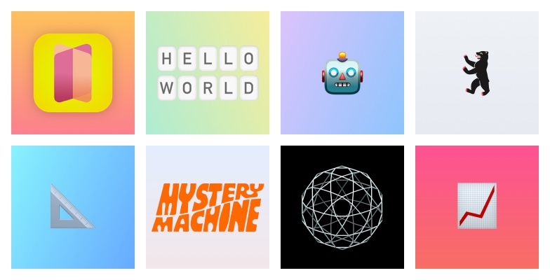
Here's what I ended up with:
Flaviobot

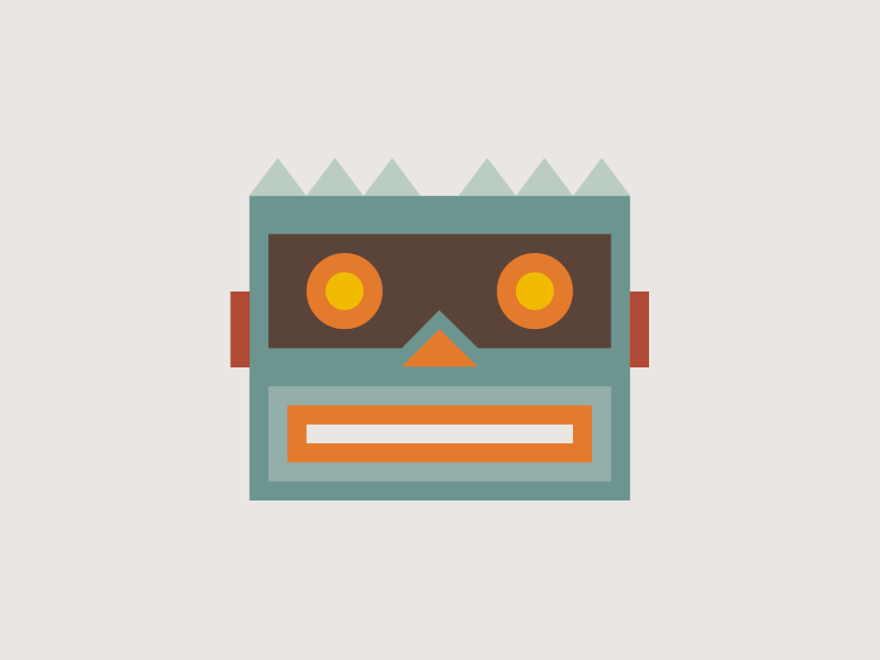
Flaviobot is a bot, so what can picture it better than a robot? I got inspired by the vintage wind-up toys robot, precisely this one, that I also happen to own and to constantly have on my desk.
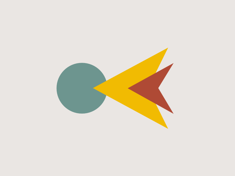
Kult Resizer
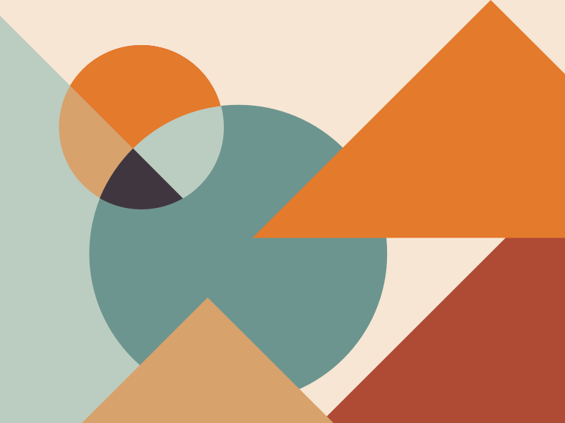
Kult Resizer is a tool for working with pictures, so I went with a sort of abstract version of the classic image placeholder icon. With some (ok, maybe a lot of) fantasy you might even say that I'm picturing the sun, a lake and some mountains.
Flipping Cards
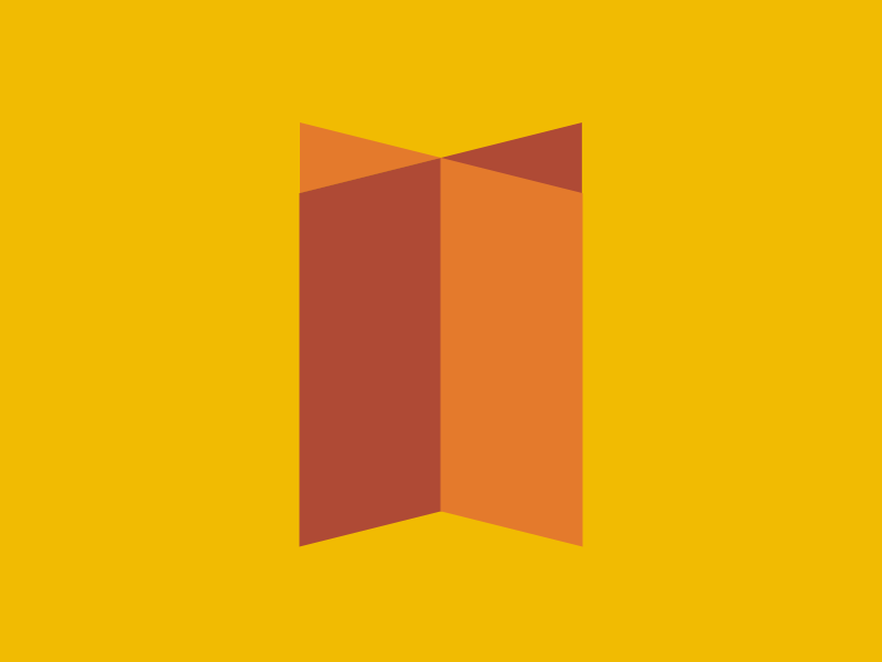
Since Flipping Cards is an iOS/Android app it also turns out to be my only project that already has an official icon. So I just designed a simplified, no-gradients version of the original icon, that can blend better with the other illustrations.
Technoland
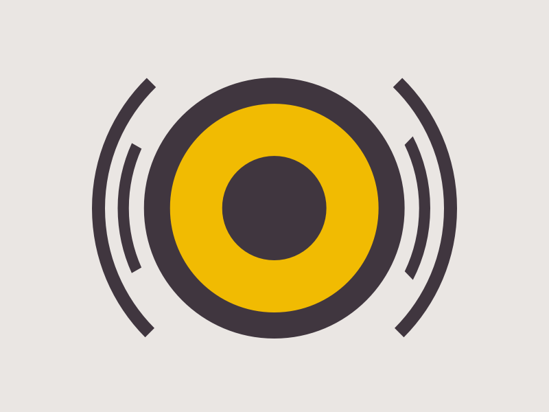
Some might say it looks like an eye. But in reality it's supposed to be a sound speaker. I was mainly inspired by this one.
Chasm
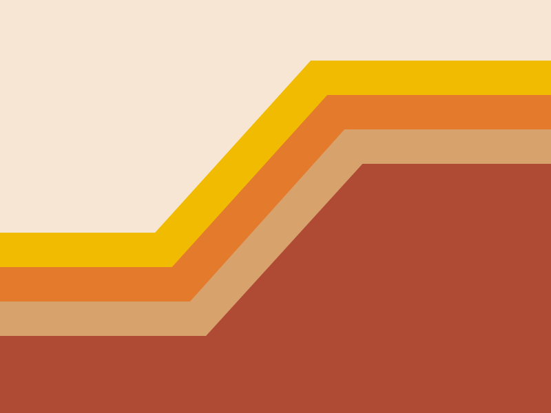
Chasm is a trading bot. Therefore I designed a simplified version of a trading line chart, obviously with some profits 🙂
Mystery Machine
I thought that nothing can represent Mystery as good as a question mark. So I decided to design a stylized version of it, by using the shapes that I was allowed to use.
React Native Quiz Input
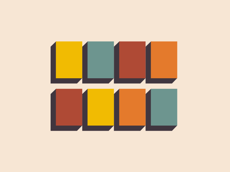
This is the very first one that I designed. I didn't have to think too much about it: the library allows you to have individual character inputs, therefore each colored box represents a single letter input.
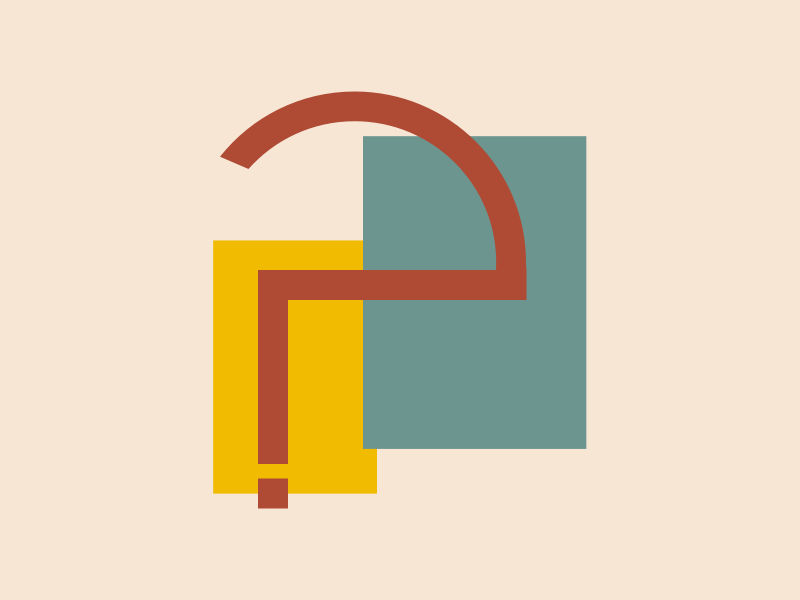
West Berlin CSS
The first idea here was to design a simplified version of the TV tower. But then I realized that this would have been conceptually wrong, since the tower is in East Berlin. Therefore I tried to think about something as iconic as the tower but in West Berlin. Since I couldn't really find one, I decided to symbolize the concept more. What I designed is an abstract version of a compass, with an arrow pointing west.
Conclusions
It was definitely a funny experiment. I also realized that sometimes having constraints helps achieving better results. In this case for example I decided to design all the elements in a 32x32 square grid. This forced me to use only simple shapes and to unify the thickness of lines and the size of elements. The extra benefit of this is that these images are working pretty well even in a small format, like for the example in the right sidebar of a single project page. I also took inspiration from old Bauhaus posters for the color palettes and avoided gradients or too bright colors.
With these ideas in mind I think I achieved my goal of having illustrations that blend with the look and feel of the rest of the website.